Start with the idea that should stay the same
Adapting a campaign is not the same as making a separate campaign for every group. Begin by writing the central idea in one sentence: what are you inviting people to notice, believe or do? Then identify the product truth behind it. If that truth changes from one ad to the next, the campaign may not have a stable foundation.
Imagine a neighborhood print shop promoting custom notebooks with the idea “Make room for your next idea.” The shop can show a student planning a project, a café owner testing menu sketches and a parent keeping family notes. The situations differ, but the invitation remains recognizable. This is a hypothetical creative exercise, not a claim about a business or its customers.
Set down a few constants before designing anything: the core promise, the campaign line if there is one, the visual motif and the desired action. These anchors make it easier to vary the work deliberately rather than letting each version drift toward a different message.
Define segments by useful differences
Audience segments are most useful when they reveal a difference that can change the creative work. A broad label such as “young adults” may tell you less than “people buying a notebook for daily planning.” Consider the audience’s task, level of familiarity with the offer, likely hesitation and reason to care. These are starting assumptions to check against what your business knows, not fixed descriptions of people.
For the notebook campaign, a gift buyer may want help choosing a design, while someone ordering for a team may need to understand customization options. Both can respond to “Make room for your next idea,” but they need different supporting information. If two proposed segments would receive the same message, image and next step, you may not need separate versions.
Keep the number of segments manageable. A short worksheet with one row per group can record the situation, relevant benefit, question to answer and action to request. This prevents minor demographic distinctions from multiplying the amount of production work without improving clarity.
Change the evidence, not the promise
Once the shared idea is clear, decide what each audience needs to see or hear to find it credible. The evidence might be a product detail, a demonstration, a use case or a clear explanation of the buying process. Avoid swapping only a face or a background while leaving an irrelevant message untouched.
In a version for a gift buyer, the print shop might show a finished notebook being wrapped and use copy about choosing a cover that suits the recipient. A team-order version could show several notebooks with coordinated covers and explain which details can be customized. Neither version needs to suggest that the notebook will transform someone’s life. Ordinary, specific details often do more work than an inflated claim.
Match the call to action to the decision at hand. “Explore cover options” helps someone browsing; “Ask about a team order” gives a group buyer a clearer next step. The campaign line can stay consistent while the supporting copy answers different questions.
Build a flexible visual system
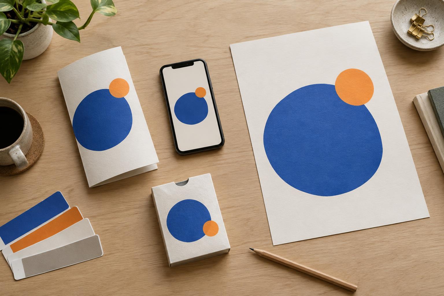
A campaign feels connected when its parts share recognizable design choices. That does not require identical layouts everywhere. Choose a small set of repeatable elements, such as a color relationship, type hierarchy, photographic approach or framing device. Decide which elements must appear in every version and which can respond to the audience or format.
For example, the notebook campaign might use an overhead photograph, generous open space and a handwritten mark suggesting an unfinished idea. The objects beside the notebook can change by segment, but the composition and treatment remain familiar. Show the product in a way that accurately represents what is offered; a prop should support the story, not imply an unavailable feature.
Plan for the formats you will actually produce. A poster may need a short line readable at a glance, while a product-page panel can explain choices in more detail. When resizing or cropping, check that the key object, message and call to action still make sense together. A flexible system gives each placement room to work without sacrificing recognition.
Review the versions as one campaign
Before production, place all the versions side by side. Can someone identify the common idea without reading a planning document? Is each version meaningfully useful to its intended audience? Look for unsupported claims, stereotypes and details that accidentally exclude a potential buyer. Review each piece on its own as well: people may encounter only one version.
A simple review grid can list the shared promise, audience-specific question, proof shown, call to action and visual constants for every execution. It makes gaps visible. If one version has no clear evidence, strengthen it; if another needs a completely different promise, reconsider whether it belongs in this campaign.
Finally, leave room to learn from real responses without assuming an outcome in advance. Questions customers ask, confusion during ordering or feedback from people familiar with the audience can help refine the next version. The goal is not to make every ad look the same. It is to make each variation feel like a thoughtful expression of one clear idea.