Write the message before the formats
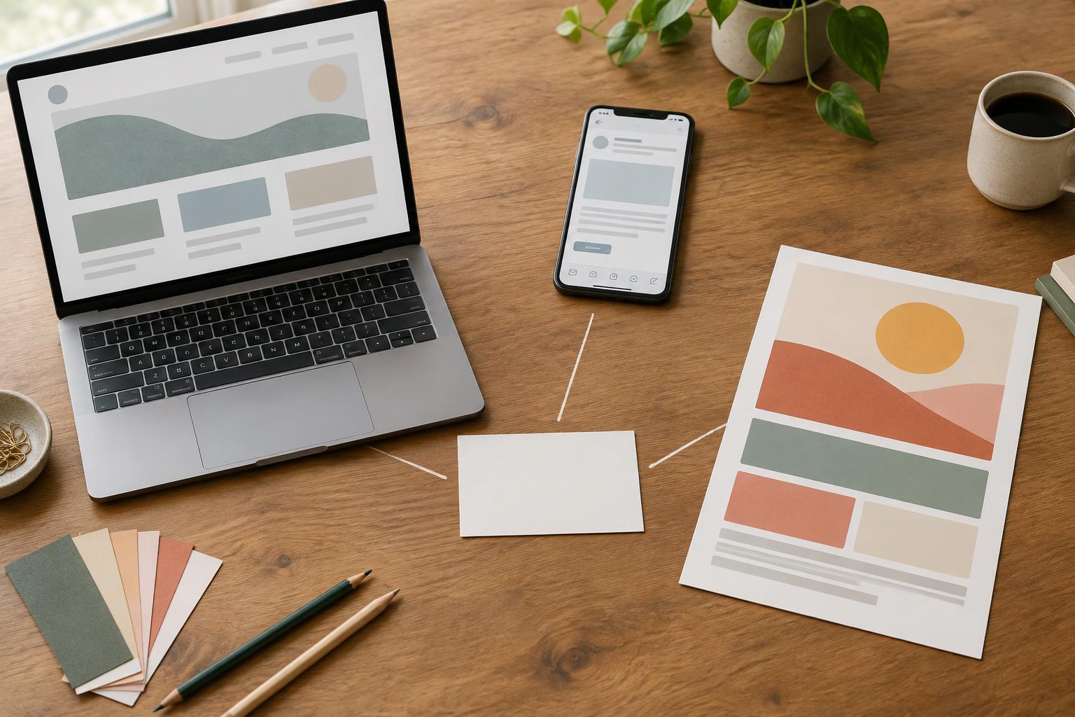
Adapting copy does not mean shrinking a website paragraph until it fits on a flyer. It means deciding what a reader needs to understand and then presenting that information in a form suited to each channel. The offer, audience, and next step should stay consistent. The opening and level of detail can change.
Consider an illustrative brief for a small studio offering a beginner pottery session. Its core message might be: “Try a beginner pottery session and learn the basics of shaping clay. Reserve a place.” Before drafting, the studio would need to confirm practical facts such as the location, session length, price, availability, and what participants should bring. Those facts should come from the actual offer, not from a copywriter filling gaps.
Make a short message sheet with three parts: the main benefit, the essential details, and one call to action. For this example, the benefit is a chance to try shaping clay as a beginner; the action is to reserve a place. That sheet gives every version a common foundation without forcing every version to use the same sentences.
Use the website to answer likely questions
A website page can give the offer room to breathe. A visitor may arrive from a search, a social post, or a printed piece, so the page should make sense without requiring earlier context. Lead with the activity and intended audience, then explain what happens, who it is for, and how to book. Put confirmed details near the booking action rather than making visitors hunt for them.
A possible opening is: “Curious about pottery? Join a beginner session focused on the basics of shaping clay. You do not need previous experience to get started.” Below it, the studio could add a brief outline of the session and its verified booking details. A button reading “Reserve a place” gives the visitor a clear next step.
The page does not need to carry every thought in one dense paragraph. Short sections with useful headings can separate the introduction, practical information, and booking instructions. If a detail affects someone’s decision, such as accessibility, age requirements, or cancellation terms, make it easy to find and check that it accurately reflects the studio’s policy.
Let the email make one invitation
Email usually reaches someone in an inbox full of competing messages. Its subject line and first sentence need to establish the point quickly. Unlike the website, the email can work as an invitation that sends readers to a page with complete details. It should still include enough information for someone to decide whether clicking is worthwhile.
For the pottery brief, a subject line could be “Want to try a beginner pottery session?” The body might read: “If you have been curious about working with clay, our beginner session is a place to start. We will focus on the basics of shaping clay. See the session details and reserve a place.” The link should lead directly to the relevant session page, not to a homepage where the reader must search again.
Resist adding several unrelated announcements just because there is space. One main invitation and one clear action make the message easier to scan. If the email goes to an existing audience, its greeting can be warmer, but avoid assuming every recipient already knows the offer or has expressed interest in pottery.
Make the flyer understandable at a glance
A flyer may be seen on a noticeboard, picked up at a counter, or held for only a few seconds. Its headline should identify the offer before its supporting copy adds texture. The reader also needs a practical way to act without having to remember a long web address. A short, verified address or a tested QR code can point to the same booking page used in the email.
A simple hierarchy for the example would be: “Try a beginner pottery session” as the headline; “Learn the basics of shaping clay” as the supporting line; then the confirmed date, place, price, and booking method. “Reserve a place” can remain the call to action. If those details are not yet confirmed, leave them out of the draft rather than printing placeholders or guesses.
Copy and layout work together in print. Leave enough space around the essential information, use type that remains readable at the intended size, and check a printed proof. A concise flyer is useful only if someone can read it and knows what to do next.
Check consistency without making the versions identical
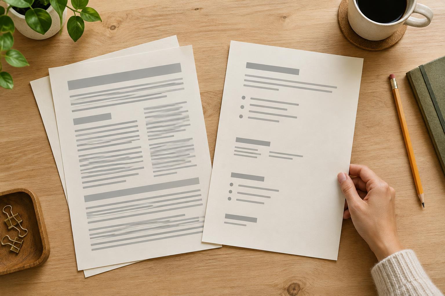
Read the three versions side by side before publishing. They should describe the same session, use compatible language for the audience, and lead to the same next step. Check concrete details especially carefully: a changed location, price, or booking instruction can turn a small copy difference into confusion. If the offer changes later, update the website and any active email or print materials that can still be changed.
Then read each version on its own. Does the website answer a newcomer’s questions? Does the email give a reason to open the link? Can someone understand the flyer without visiting the website first? These are different jobs, so repeated wording is less important than a repeated meaning.
Finally, remove claims the brief cannot support. Words such as “best,” “guaranteed,” or “perfect for everyone” rarely help a reader understand a simple offer. Specific, accurate descriptions do more work. Adaptation succeeds when each channel feels natural to use while telling people the same truthful story.