Start with the decisions the board needs to support
A mood board is most useful when it answers a question. Before collecting images, write a short brief: who the brand serves, what it offers, where the identity will appear and what it should feel like. “Welcoming but precise” gives you more to work with than “modern.” If the identity must work on a shop sign, packaging label and social profile, note those uses now. They will help you judge whether a visual direction is practical, not just appealing.
Choose three or four qualities to explore, then define what they mean in context. For a small neighborhood bakery, “warm” might mean natural light and approachable language, while “precise” might mean clear labels and orderly layouts. These are working hypotheses, not rules. The board should help you see whether the qualities fit together and reveal where the brief needs clarification.
Collect references for different jobs
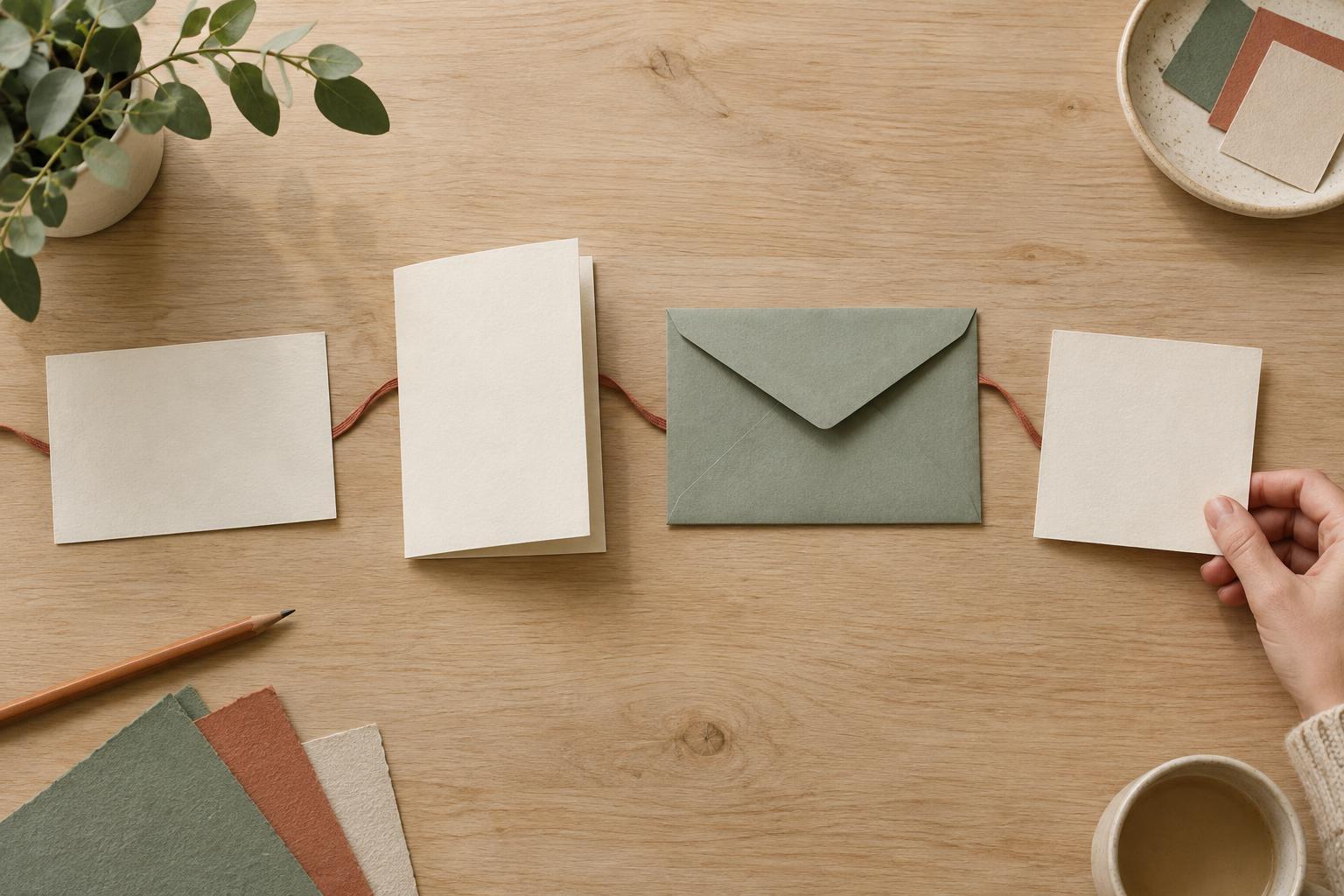
Gather material that speaks to typography, color, photography, illustration, composition and physical texture. Look beyond other brand identities: a book cover might suggest a type hierarchy, a café interior might suggest a palette, and a product photograph might suggest how much space to leave around an object. Include examples of the places the identity will live, too. A beautiful typeface that is hard to read at label size may not be a useful reference.
Keep a note beside each item explaining why it is there. “Soft shadows make the product feel calm” is more helpful than “love this.” Avoid collecting a complete identity you hope to imitate. You want references to individual qualities and techniques, not a ready-made solution. If you are working with someone else’s brand, ask about references they like and dislike, then find out which specific features prompt those reactions.
Edit until the direction is clear
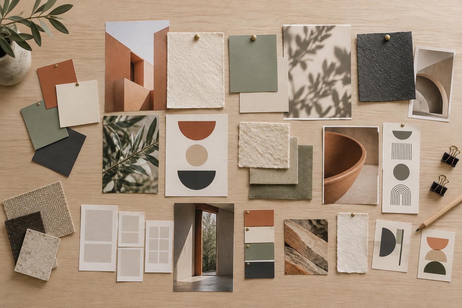
A large collection is an exploration; a mood board is an edit. Select a manageable set of references that reinforce the same direction without repeating one another. If two images make the same point, keep the clearer one. If an image is compelling but pulls the board toward a different audience or tone, move it to a separate exploration rather than letting it blur the message. Give images enough room to be viewed, and avoid arranging everything into a polished collage that hides the individual evidence.
Look for contradictions worth discussing. A bold, condensed headline may create energy, while delicate imagery suggests quiet refinement. That pairing could be distinctive, or it could make the brand feel undecided. Label the tension instead of hoping it will resolve itself. When useful, make two alternative boards with clear names, such as “bright and conversational” and “quiet and considered.” Distinct options invite better feedback than several boards with barely noticeable differences.
Translate visual impressions into design choices
Add short annotations that connect each reference to a possible decision. A color swatch might say, “Use a muted base so product photography stays prominent.” A packaging example might say, “Keep the name readable when the label is viewed from a distance.” These notes make the board easier to discuss and help prevent feedback from stopping at personal taste. They also leave room for the final identity to differ from its references.
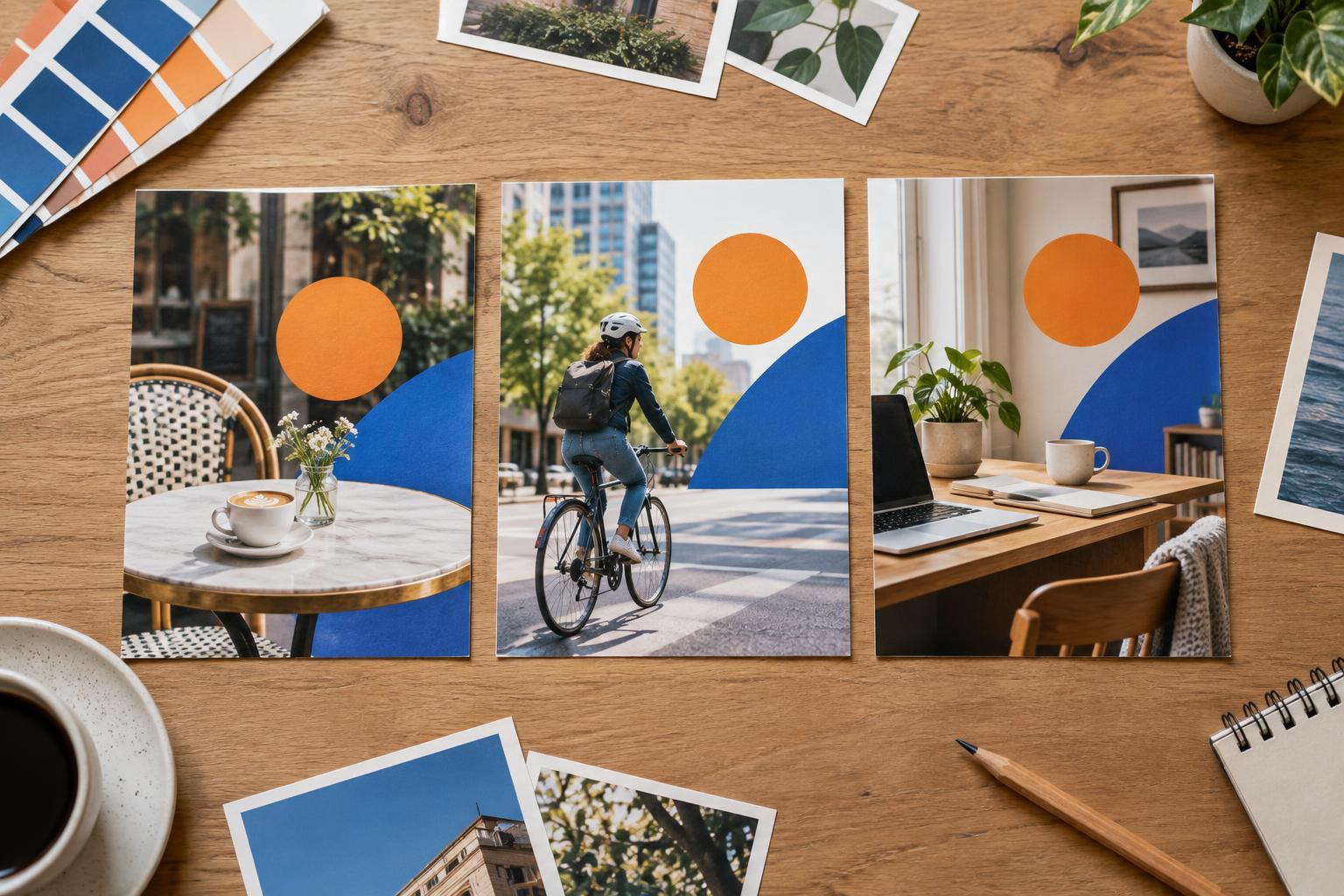
Try a small application before calling the direction settled. Place a sample headline, a placeholder product image and a few proposed colors in a simple label or social post. This is not a finished design; it is a check on how the ingredients work together. Does the type hierarchy remain clear? Do the colors provide enough contrast for important text? Does the imagery suit the actual product or service? Revise the board if the answers expose a gap.
Use the board as a guide, not a template
When presenting the mood board, explain the brief it responds to, the qualities it proposes and the choices still open. Ask focused questions: “Does this level of playfulness fit how you speak to customers?” or “Would this photographic approach be feasible to maintain?” Record decisions as well as objections. A stakeholder may reject an image because of its subject while still liking its lighting; separating those points keeps useful direction from being discarded.
Once agreed, keep the board alongside the identity work as a reference for the overall feel. It can guide choices about photography, copy and print materials without requiring every asset to look identical. If the project changes, update the board or its notes so they reflect the current brief. The goal is not to prove that every design element came from a particular picture. It is to give everyone a shared, practical way to judge whether the identity is heading in the right direction.