Give the pattern a job before giving it a style
A pattern can make a package, social post, or printed card feel distinctive. But decoration alone is a weak starting point. Before drawing, decide what the pattern needs to communicate or help organize. Should it suggest movement, make technical information feel approachable, or connect a set of materials that use different photographs? One clear job gives you a way to judge every design choice that follows.
Write a short design brief in ordinary language. For example, an imaginary neighborhood bakery might want graphic shapes that express its made-by-hand process without relying on pictures of bread everywhere. The brief could call for a warm, imperfect rhythm that leaves room for menus and prices. That direction is more useful than asking for something simply “playful,” because it points toward both a visual idea and a practical constraint.
Find a visual source that belongs to the brand
Look for forms in the brand’s work, materials, name, or customer experience. A bakery might study the curve of a folded pastry, the marks left by a scoring blade, or the repeated lines of a cooling rack. A repair studio might draw from seams, joins, and fastening points. These are starting points, not instructions to trace an object literally. Simplifying a recognizable detail often produces a shape that feels relevant without becoming an illustration.
Choose one or two characteristics to carry forward: perhaps a rounded edge and a short diagonal cut. Then sketch several versions with different proportions. Avoid collecting too many unrelated motifs. If every shape has a different origin, the finished pattern may look like a set of stickers rather than one identity. A small visual vocabulary is easier to remember and easier for a team to use consistently.
Build a system, not a single repeat
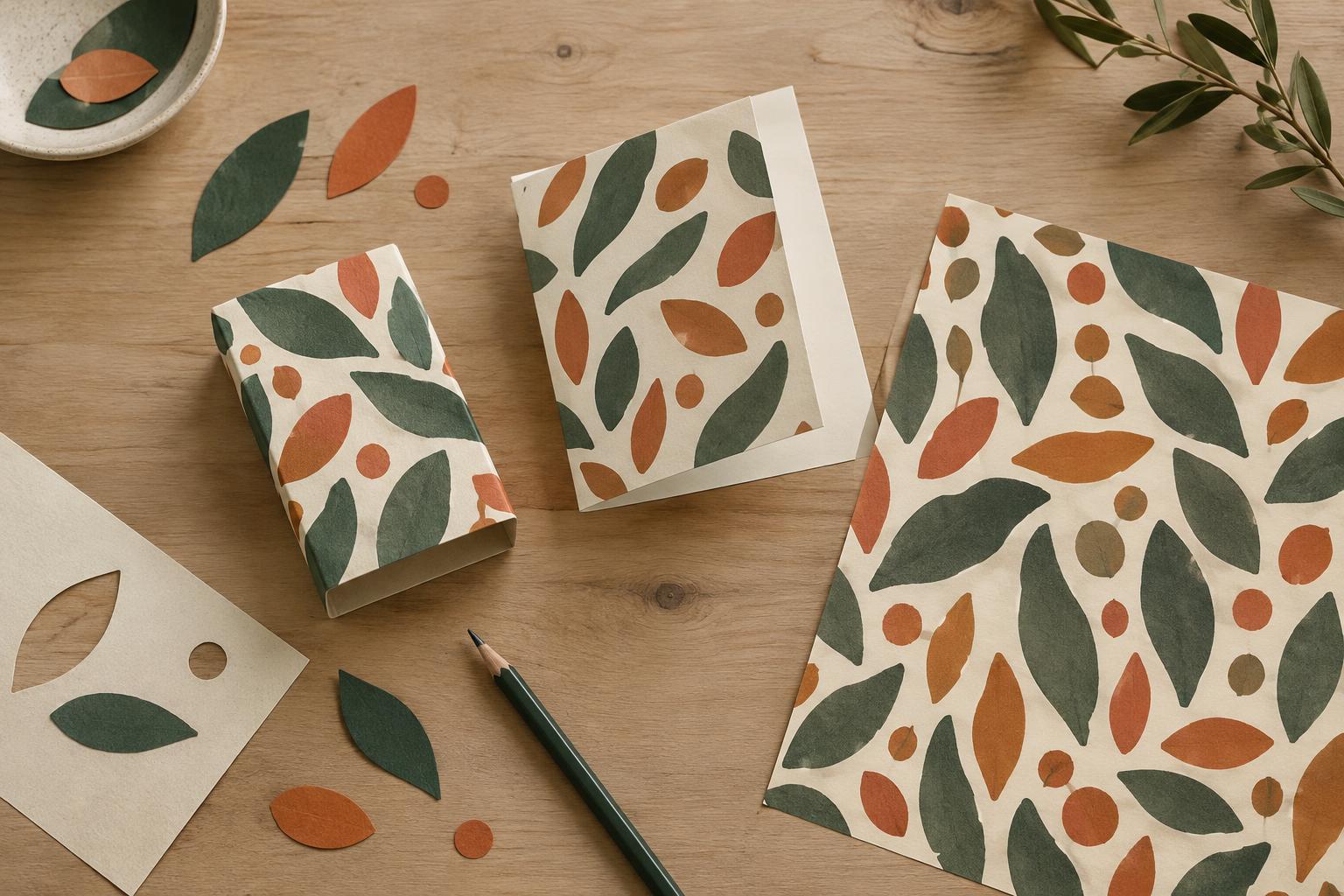
A useful pattern system has rules for its parts and for the spaces between them. Decide which shapes can rotate, overlap, stretch, or change color. Set a spacing range rather than placing each element by instinct. You might use a dense arrangement for a wrapping sheet, a loose arrangement along the edge of a menu, and one enlarged shape as a background for a headline. The applications differ, but their shared forms and spacing make them feel related.
Create at least three compositions from the same ingredients: a continuous repeat, a small corner accent, and a larger cropped shape. This prevents the identity from depending on a full-page pattern that will not fit every format. Keep a quiet version, too. A pattern that can step back behind important information is often more useful than one that demands attention in every application.
Test the pattern where people will actually see it
Place the shapes into realistic layouts before deciding they are finished. Try a narrow mobile image, a square post, a business card, and a page with a long block of copy. Check whether the pattern competes with the logo, obscures a photograph, or makes small text harder to read. If it does, reduce its density, move it away from content, or use fewer colors. The pattern should support the message, not force every message to work around it.
Also test at the size and in the production method you expect to use. Thin lines and tiny gaps can disappear when reduced; intricate shapes may become muddy on textured paper. Print a sample on an ordinary office printer to catch obvious problems, while recognizing that it will not predict every result from a professional print process. A strong system remains recognizable when details are simplified.
Write simple rules so the idea survives handoff
Once the system works, document a few examples of correct use. Specify the approved shapes, color combinations, minimum spacing from text, and situations that call for the quiet version. Show an example of a full repeat and one of a restrained accent. If rotating or cropping shapes is allowed, say so; if stretching them changes their character, rule it out.
Return to the original brief for a final check. Can you explain why these forms suit the brand without pointing only to a trend or personal preference? Can the shapes work when the logo is small or a photograph is absent? Purpose does not mean every viewer must recognize the source of a shape. It means the pattern has a reason to exist, a role in communication, and rules that let it keep doing that job across different materials.