Start with the information, not the fonts
Typography hierarchy is the order in which a reader notices and understands text. It helps distinguish a headline from a section label, a product detail from a price, and a call to action from supporting information. Before choosing sizes or typefaces, list the kinds of text your brand regularly uses. A small business might need campaign headlines, page titles, subheadings, body copy, captions, prices and button labels. These are the jobs your type system must perform.
Next, decide which information should lead in common situations. On a poster, the main message may need to be understood at a glance. On a service page, the title should set context while subheadings help readers scan for answers. Do not make every line prominent. If a discount, slogan, product name and website address all compete for first place, the reader has to work out the order for themselves.
Give each level a clear role
Build a small set of reusable levels rather than styling each piece of text from scratch. For example, define a display style for short campaign messages, a heading style for pages or sections, a subheading style for smaller groups of information, and a body style for sustained reading. Add a caption or label style only if your materials need one. Write down each style’s intended use alongside its visual settings; a list of font sizes alone will not tell someone when to use them.
A hierarchy should show meaningful differences between adjacent levels. Size is one tool, but weight, spacing, case and placement also affect emphasis. A large, light headline can lead a page without feeling heavy; a compact, bold label can identify a category without looking like another headline. Reserve all caps for brief text if it suits the brand, and avoid relying on color alone to distinguish important information. Readers should still see the order when the design is viewed in grayscale.
Choose typefaces that can do the work
You do not need a different font for every level. One versatile type family with several weights can provide enough contrast for many brands. If you use a second typeface, give it a specific purpose, such as expressive campaign headlines or long-form reading. Test the pairing with real words from your business, including long product names, numbers and punctuation. A combination that looks convincing in a short mockup may be awkward in a detailed price list.
Check the practical limits of your choices before building the system around them. Does the font include the characters your brand needs? Are the weights you plan to use available for your website and production files? Can collaborators access them under the relevant license? If not, choose a suitable alternative or specify a fallback. Consistent use of an available typeface is more useful than a distinctive choice that repeatedly gets replaced.
Set a scale, then test it in context
Create a starting specification for each level: typeface, weight, size, line spacing and, where useful, letter spacing. Use the relationships between levels as your guide rather than copying one set of measurements into every format. A headline on packaging, a headline on a phone screen and a headline on a shop sign can share a visual character without sharing an exact size. Body copy should be comfortable to read at its intended viewing distance.
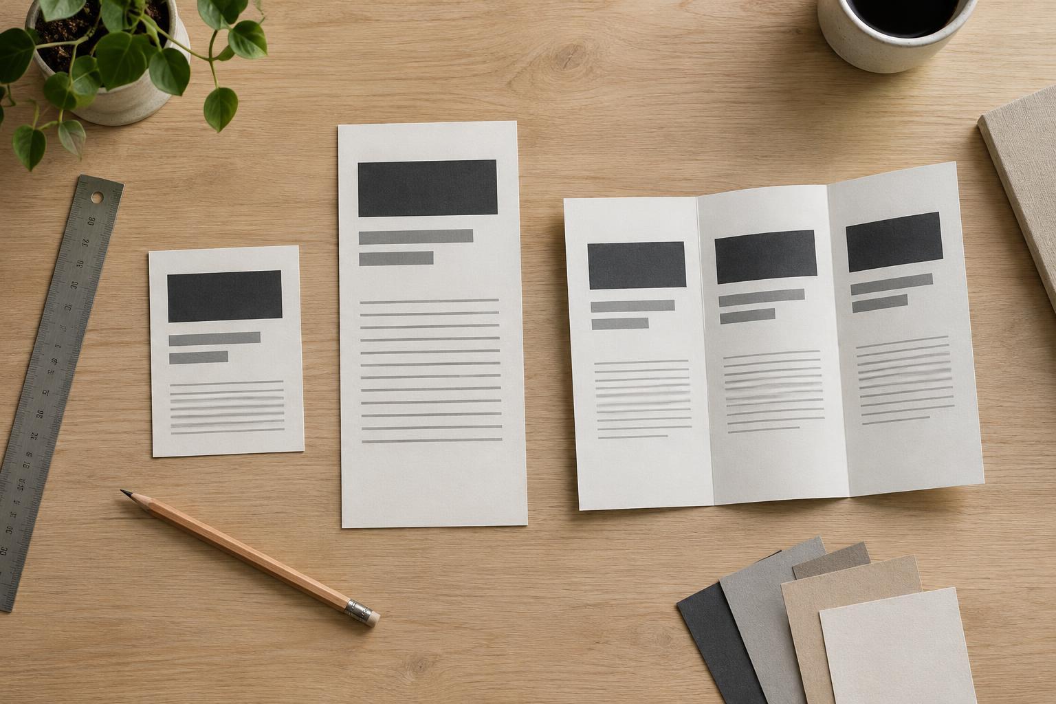
Apply the proposed styles to a few realistic layouts, such as a social post, a web page, a flyer and a simple invoice. Use actual-length copy rather than placeholder text. Look for headlines that wrap poorly, labels that disappear, and paragraphs that feel crowded. Check narrow screens and print proofs when those formats matter. If a layout only works after many one-off adjustments, revise the hierarchy or simplify the content instead of adding another exception.
Document rules people can follow
A useful typography guide should show examples as well as specifications. Include a sample headline over body copy, a short caption, and a layout with several levels together. Note where each style belongs and what to avoid—for instance, using the display style for a long paragraph or introducing bold text every time a sentence feels important. Provide separate digital and print settings where needed, while keeping the roles and overall order recognizable.
Finally, treat the hierarchy as a working system. When a new format appears, first try to solve it with the existing levels. Add a new style only if it serves a recurring need that the current set cannot meet. This restraint makes it easier for different people to produce materials that feel related, and easier for readers to understand what matters wherever they encounter the brand.