Start with the relationship customers need to see
A product identity has two jobs: help someone recognize the product and show how it relates to the business behind it. Those jobs become harder as a range grows. If every package looks identical, customers may struggle to find the item they want. If every package looks unrelated, the parent brand loses visibility. The goal is not perfect uniformity; it is a clear relationship.
Before designing, list every product and the decisions a customer makes when choosing between them. Are the products different flavors, sizes or materials within one familiar range? Do they serve different audiences or uses? Where will people see them together: on a shelf, in an online shop or in a sales brochure? These answers tell you which differences must be obvious and which details can stay consistent.
Choose a structure before choosing colors
One approach is to make the parent brand the main identity and treat product names as descriptors. A maker called Field & Form, for example, might sell Field & Form Daily Soap and Field & Form Hand Balm. This works when the products benefit from being recognized as one family. The name, logo and basic layout remain steady, while a prominent product label helps people distinguish each item.
A second approach gives a product or range its own name but visibly connects it to the parent. Field & Form might introduce a more specialized range called Grove, with “by Field & Form” appearing consistently on its packaging. This gives Grove a distinct character without hiding who makes it. If products have very different audiences or purposes, separate identities may make sense, but they require more work to explain and maintain.
Choose the simplest structure that makes the range understandable. A new logo for every variation can feel exciting during design and confusing in use. Conversely, forcing very different offerings into one naming pattern can produce awkward labels. Sketch the whole range as a list of names before committing to an identity system; naming problems are often easier to spot in plain text.
Build recognition and distinction into the same layout
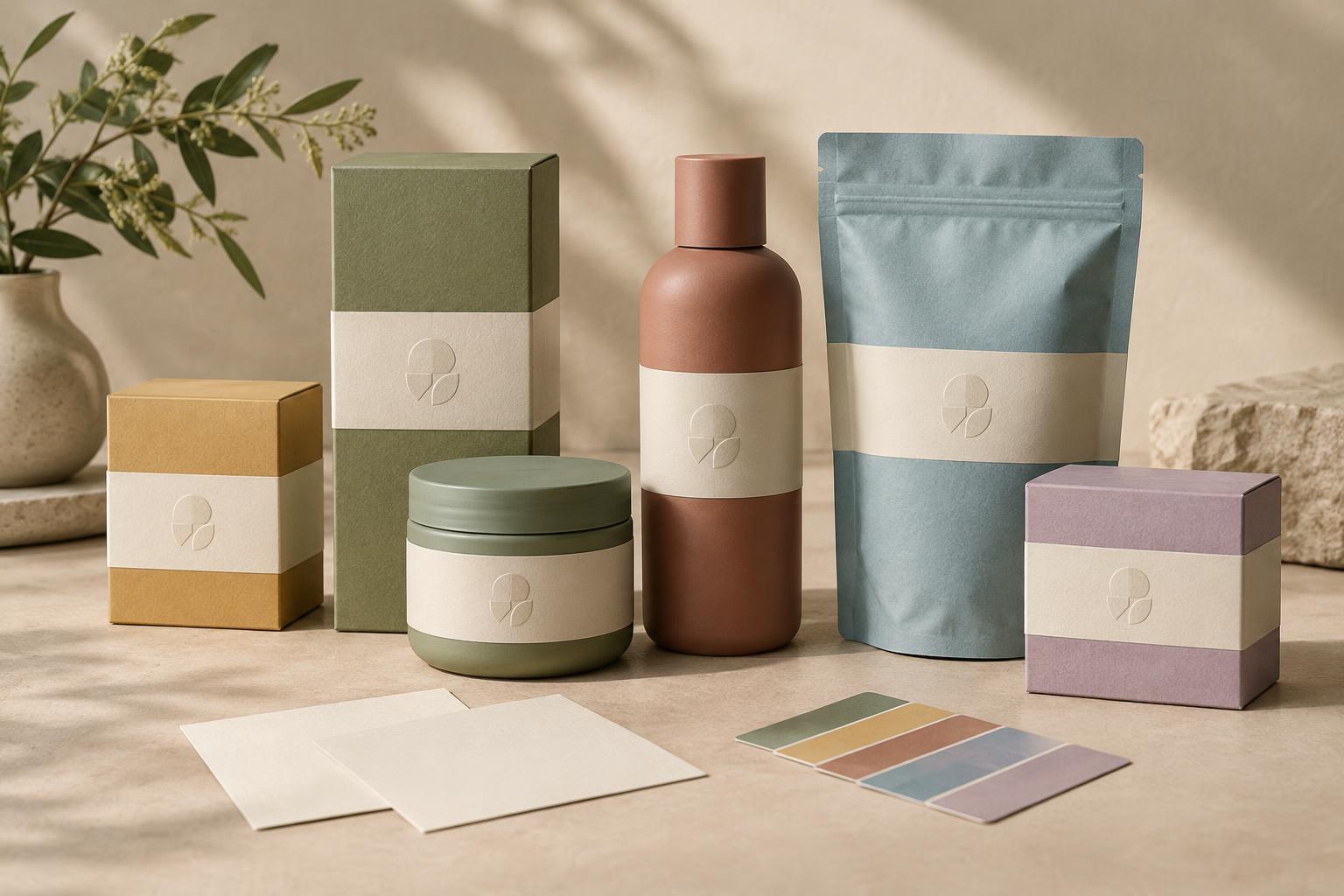
Think of the visual system in layers. The fixed layer might include the parent logo, typefaces, a consistent label shape and the position of key information. The variable layer could include a color, image, pattern or illustration style assigned to each product. A third layer contains practical details such as size, scent or intended use. Give each layer a clear role rather than asking color alone to communicate everything.
For example, a small coffee brand could use the same wordmark and package grid across its range. Each blend could have a distinct name and illustration, while roast information always appears in the same place. Someone scanning the packages can recognize the maker first and then compare the blends. The same principle applies to website tiles and social graphics: shared structure signals a family, while carefully chosen differences make navigation easier.
Test the system at the sizes and distances where people will encounter it. Line up rough package mockups, shrink product images to thumbnail size and view names in a simple online-shop grid. If two products become indistinguishable, strengthen a useful difference. If the parent brand disappears, make its placement or treatment more consistent. Check that important distinctions remain clear without relying only on color.
Write rules the team can actually use
A product identity system is most useful when someone can apply it to the next product without starting over. Document a few decisions: how products are named, when the parent logo appears, which elements stay fixed, which elements may change and how product descriptions should be written. Include examples of a package front, an online listing and a promotional image. These examples reveal gaps that a page of abstract rules may miss.
Leave room for growth, but avoid designing imaginary ranges in excessive detail. You might reserve a naming pattern and a layout space for future products without assigning every possible color now. When a new item arrives, ask whether it fits the existing structure or represents a genuinely different offer. A coherent brand family is not one where everything matches. It is one where customers can quickly understand both what each product is and who stands behind it.