Start with the places the logo must work
A logo is often designed while enlarged on a screen. At that scale, every curve and letter can look deliberate. Reduce it to the size of a social profile image, a website header, or a small product label, and a different question appears: can someone still identify it without leaning in? Small-size testing is less about judging whether the design is attractive and more about checking whether its essential features survive.
Make a short list of realistic uses before you begin. Include both screen and print applications if the business needs both. A square profile image, a narrow website header, an email signature, and a modestly sized label offer more useful tests than an arbitrary tiny version on a blank artboard. Place the logo at approximately the size it would occupy in each setting. If the final dimensions are not yet known, test several sizes rather than treating one measurement as a universal pass or fail.
Build a simple test sheet
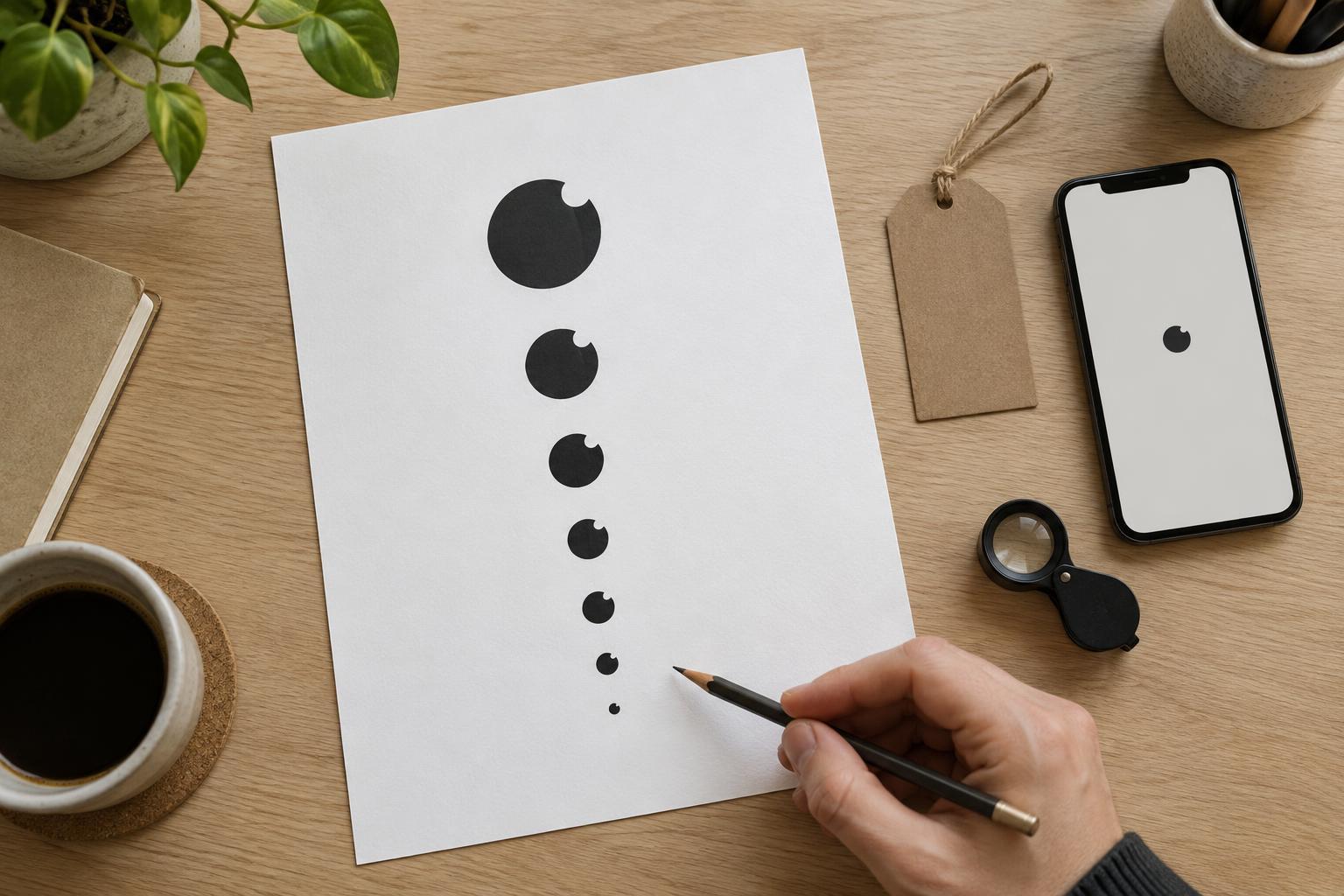
Create one page showing the logo large, medium, and small, with each version displayed at its intended size rather than zoomed in. Give the examples enough surrounding space to resemble their likely use. Try the mark on a light background and a dark background, using approved color versions where available. Add a one-color version to see whether recognition depends on a color effect that may not be available in every application.
For screen uses, preview the sheet at normal viewing scale on a phone and a computer. For print uses, print it at actual size on an ordinary printer before evaluating it. A screen preview cannot fully predict ink spread, paper texture, or the quality of a particular printing process, but a physical proof can reveal problems that a glowing display hides. Keep the first test straightforward: do not sharpen a preview or enlarge a printed sample to rescue details that viewers will not see.
Check recognition before fine detail
Look away, then glance at the smallest version for a moment. Can you recognize the main shape? If the logo includes a name, can you read it without already knowing what it says? Ask someone unfamiliar with the design to do the same. Their first impression is often more useful than a designer’s, because a designer can mentally fill in a letter or symbol that has become unclear.
Next, inspect the parts that tend to fail as a logo shrinks. Thin strokes may fade; tight spaces inside letters may close; small gaps between shapes may disappear. A detailed illustration may turn into a dark patch, while a short tagline may become unreadable. Also check whether the logo has enough contrast against its background. Make notes about the specific failure, such as “the two letters touch” or “the symbol loses its center,” rather than giving the whole design a vague score.
Revise the cause, not just the size
When a test fails, shrinking the artwork a little less is not always a useful fix. The final placement may have a fixed amount of room. Instead, consider whether a stroke can be slightly stronger, a narrow gap can open up, or unnecessary detail can be removed. If the name is hard to read, review the lettering and the space between letters. If the symbol is unclear, protect the features that make it distinctive and simplify secondary decoration.
Some logos need a small-size variation rather than one version forced into every situation. A full lockup might include a symbol, business name, and tagline; a compact version might omit the tagline or arrange the name beside the symbol. An icon-only version can suit a small square space, provided people can connect it to the business in context. These should be deliberate variations of one identity, not unrelated substitutes. Test each variation in the places where it is meant to appear.
Decide what passes and document it
A successful small-size logo does not need to show every detail visible in the large version. It does need to preserve the information that matters for that use. For a new business, a readable name may be more valuable in a website header than a clever symbol alone. For a familiar mark used beside other identifying information, a compact symbol may be sufficient. Judge the version against its job, not against an expectation that every application must use identical artwork.
Once the tests are complete, record which version works in each common setting. Note any minimum size you have tested successfully, the backgrounds each version can sit on, and when the tagline should be removed. These notes give the next person producing a social image, label, or flyer a practical starting point. If a new material or placement changes the conditions, test again at actual size; the goal is a logo that remains clear where people encounter it, not only where it was designed.