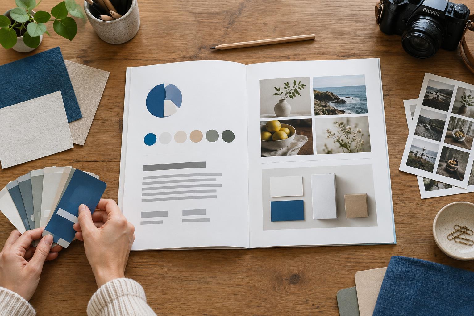
Start with the decisions the guide needs to support
A useful brand style guide answers the questions that come up while making real materials: Which logo belongs on a dark background? What typeface should a flyer use? How should a social post sound? For a small business or creator, a short guide that answers those questions is more valuable than a polished document nobody consults.
Begin with a brief description of who the brand serves, what it offers and the impression it aims to create. Keep this to a few sentences rather than a page of abstract adjectives. Then list the materials the guide must cover, such as a website, packaging, proposals, social graphics or printed signs. That list will help you decide which rules need examples. If someone else regularly designs or writes for the brand, ask what they have to guess; those gaps are good candidates for the guide.
Make logo and color rules easy to apply
Show the primary logo and any approved alternatives, such as a compact mark for a small profile image or a one-color version for simple printing. Explain when to use each one. Include a minimum size at which the logo remains legible and a clear-space rule, even if that rule is as simple as leaving space equal to the height of one letter around it. Show a few mistakes to avoid, such as stretching the artwork, changing its proportions or placing it over a busy photograph.
For each brand color, provide its name and the values people will need for their work: HEX or RGB for screens and CMYK for print, if print is part of the plan. Identify a main color, supporting colors and any neutral backgrounds. Add a small example of how they work together rather than presenting swatches alone. Color can shift between screens, papers and printers, so treat printed values as starting specifications and check important pieces with a proof.
Define typography as a working system
List the approved typefaces and their roles. A simple system might use one face for headlines and another for body copy, or one versatile family in several weights. Name accessible substitutes for situations where the preferred fonts cannot be installed, such as a shared presentation template or an email. If a font requires a license, note who is responsible for supplying it; do not assume that sending a font file grants permission to use it.
Examples make type rules easier to follow than a list of font names. Show a headline, subheading, paragraph and caption at realistic sizes. Indicate which text should be bold, how much space to leave between sections and whether all-caps text is reserved for short labels. Legibility should take priority over strict uniformity: a line of tiny text may technically use the correct font while still being difficult to read on a phone or a printed menu.
Give imagery and voice their own guidance
A style guide should describe the visual choices surrounding the logo. Include a few examples of suitable photography, illustration or graphic treatments and explain what connects them. For instance, a maker might favor close views of materials, natural-looking light and uncluttered backgrounds. Say whether images may carry text and what kind of space a designer should leave for it. An example of an unsuitable image can clarify the boundary without requiring a long list of rules.
Write a short voice section for the words people will see alongside those images. Describe the brand’s tone in practical terms: direct and helpful, perhaps, rather than formal and ornate. Show one or two pairs of sample lines, such as a clear product description beside an overly vague alternative. Include conventions that tend to drift, like how to write product names, calls to action and customer-facing headings. Voice guidance should help a writer choose words, not force every sentence into the same pattern.
Test the guide on everyday materials
Finish with examples of the pieces your team actually makes. A sample social post, business card, email header or one-page flyer can demonstrate how the rules work together. These do not have to become rigid templates. Their purpose is to show sensible relationships: where the logo sits, how much room text gets, which colors provide emphasis and how an image is cropped.
Keep approved logo files, color values, templates and the guide together in a clearly named shared folder. Label files so someone can distinguish a print-ready logo from a screen graphic without opening every version. Before calling the guide finished, give it to a collaborator and ask them to make one typical item using only what you have provided. If they have to guess, add the missing instruction or example. A style guide is most useful as a maintained reference: revise it when a recurring decision changes, and remove rules that no longer reflect how the brand works.