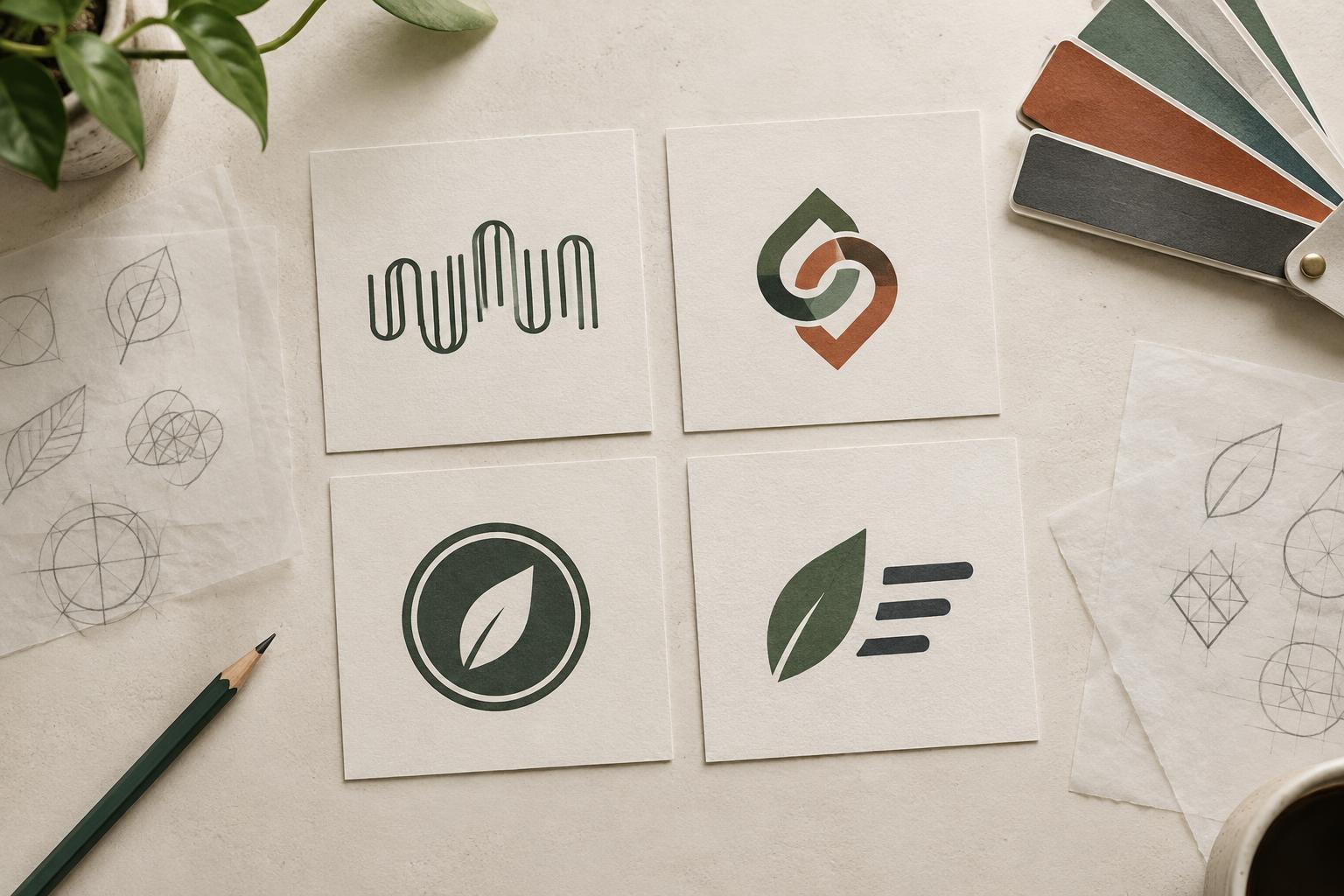
Start with the job your logo needs to do
A logo is not the whole brand identity. Color, typography, imagery, language, and layout also shape how people recognize a business. The logo’s narrower job is to identify the business clearly in the places where people encounter it. Before sketching symbols, list those places: a website header, packaging label, social profile, invoice, shop sign, or the corner of a photograph.
Next, consider the name itself. Is it short enough to read at a glance? Is it unfamiliar to the audience? Does it have initials people already use? A new business with an unfamiliar name may benefit from showing that name prominently. A business whose full name rarely fits its materials might need a compact alternative. These questions make logo selection a practical decision rather than a choice based only on taste.
Wordmarks and monograms: name first or initials first
A wordmark presents the business name as the main visual element. Its character comes from the lettering: typeface, spacing, proportions, and any carefully chosen custom details. It can be a strong starting point when the name is reasonably short and needs to become familiar. For a small bakery called Field Oven, for example, a clear wordmark on bags and a storefront would repeatedly connect the visual identity with the name people need to remember.
A monogram builds a mark from initials. It can fit neatly on a small label, a profile image, or an item with little room for text. The trade-off is that initials may not tell a new audience what the business is called. If the bakery used FO alone, someone seeing it for the first time might need the full name nearby. A monogram is often most useful as a companion mark, or when the initials already have meaning for the intended audience.
Neither format is automatically simple to make well. A wordmark still needs readable lettering at its expected sizes. A monogram needs distinct letterforms, not just two characters pushed together. If it resembles a common abbreviation or another mark in your field, keep exploring.
Emblems and combination marks: adding structure or imagery
An emblem places lettering inside a defined shape, such as a seal, badge, or crest. That container can help unify several elements and work well where the logo has room to breathe, such as on a sign, label, or large piece of packaging. Its weakness is scale: small words and fine borders may disappear on a narrow mobile screen or a tiny stamp. An emblem should be tested at its smallest intended size, not just admired on a large presentation slide.
A combination mark brings a name together with a symbol. The symbol might refer to the product, suggest a quality, or create a distinctive shape without illustrating the business literally. This format can give an unfamiliar name visibility while allowing for a more compact mark later. It also asks for discipline: if the icon, lettering, and tagline all compete for attention, the result may be harder to recognize than a wordmark alone.
For Field Oven, a simple name-and-symbol pairing could work across a shop sign and packaging, with the wordmark used by itself where space is tight. That flexibility matters only if each approved version remains legible and recognizably related to the others.
Choose with a brief, not a popularity contest
Write a one-page brief before selecting a format. Include the exact business name, any required descriptor, the intended audience, three or four common applications, and the smallest likely reproduction size. Note whether the logo must work in one color, on dark backgrounds, or with a production method such as embroidery. These constraints can eliminate unsuitable directions early.
Then compare a few restrained concepts against the same questions. Can a first-time viewer read or identify the name? Does the mark still work without its preferred color? Can it be reproduced without delicate details getting lost? Is the format appropriate for the brand’s tone without leaning on generic cues from its industry? Ask a small group to describe what they saw, rather than asking only which option they like best. Their confusion can be more useful than a vote.
Avoid asking one logo to carry every message about the business. A tagline, photograph, headline, or package copy can explain what you offer. The logo can concentrate on being clear and repeatable.
Test the system before you finalize the mark
Place the leading option in realistic mockups at realistic sizes. View it in a website header, a square profile crop, a small printed label, and any other setting central to the brief. Check spacing around the mark, contrast against backgrounds, and whether the name remains readable. Print a draft at actual size when print is an important use; an enlarged screen view can hide problems.
You may find that one version cannot serve every setting. A primary combination mark and a simpler wordmark, for instance, can form a useful system if the relationship between them is consistent. Define which version goes where, and keep approved files organized so people do not improvise new arrangements. The best logo type is the one that identifies the business reliably in everyday use, not just the one that looks most impressive on its own.