Start with the surface, not the color
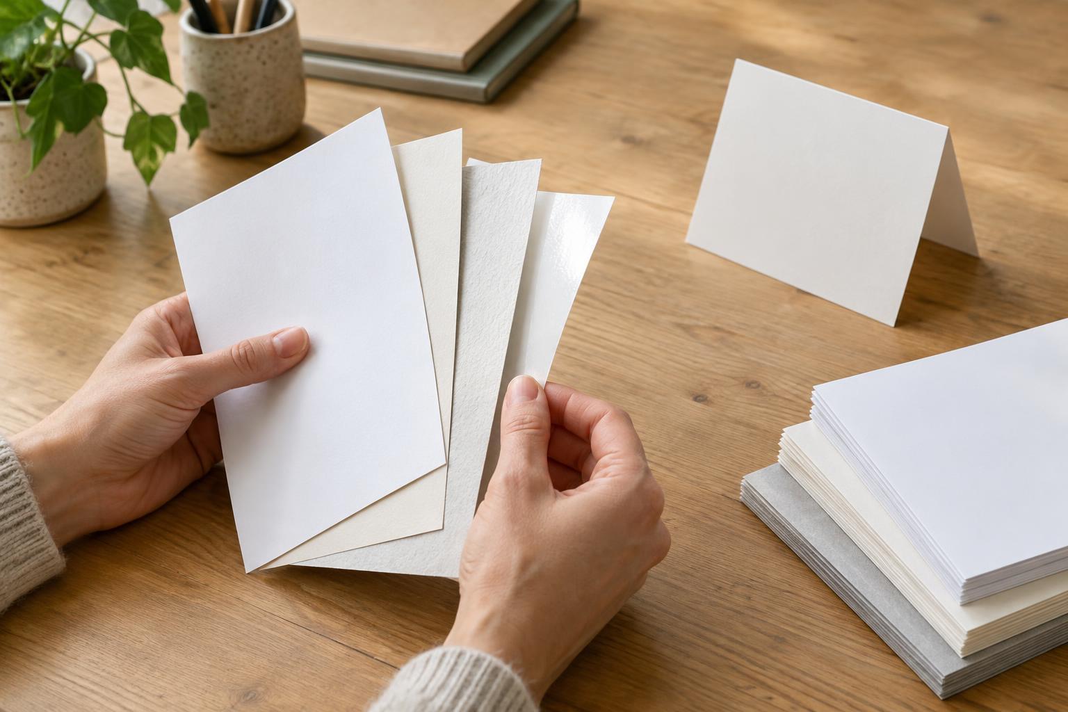
Paper is part of a design, not just the material that carries it. A menu, postcard or booklet can feel polished, relaxed or utilitarian before anyone reads a word. Two papers of similar weight may produce noticeably different results because their surfaces interact with ink and light differently.
Coated paper has a surface treatment that limits how readily ink enters the sheet. It is available in finishes such as gloss, silk and matte; those names describe a range of appearances rather than a single standard. Uncoated paper has a more exposed, absorbent surface and often feels softer or more textured. Neither is automatically the premium choice. The useful question is what the finished piece needs to communicate and how people will use it.
What happens to color and images
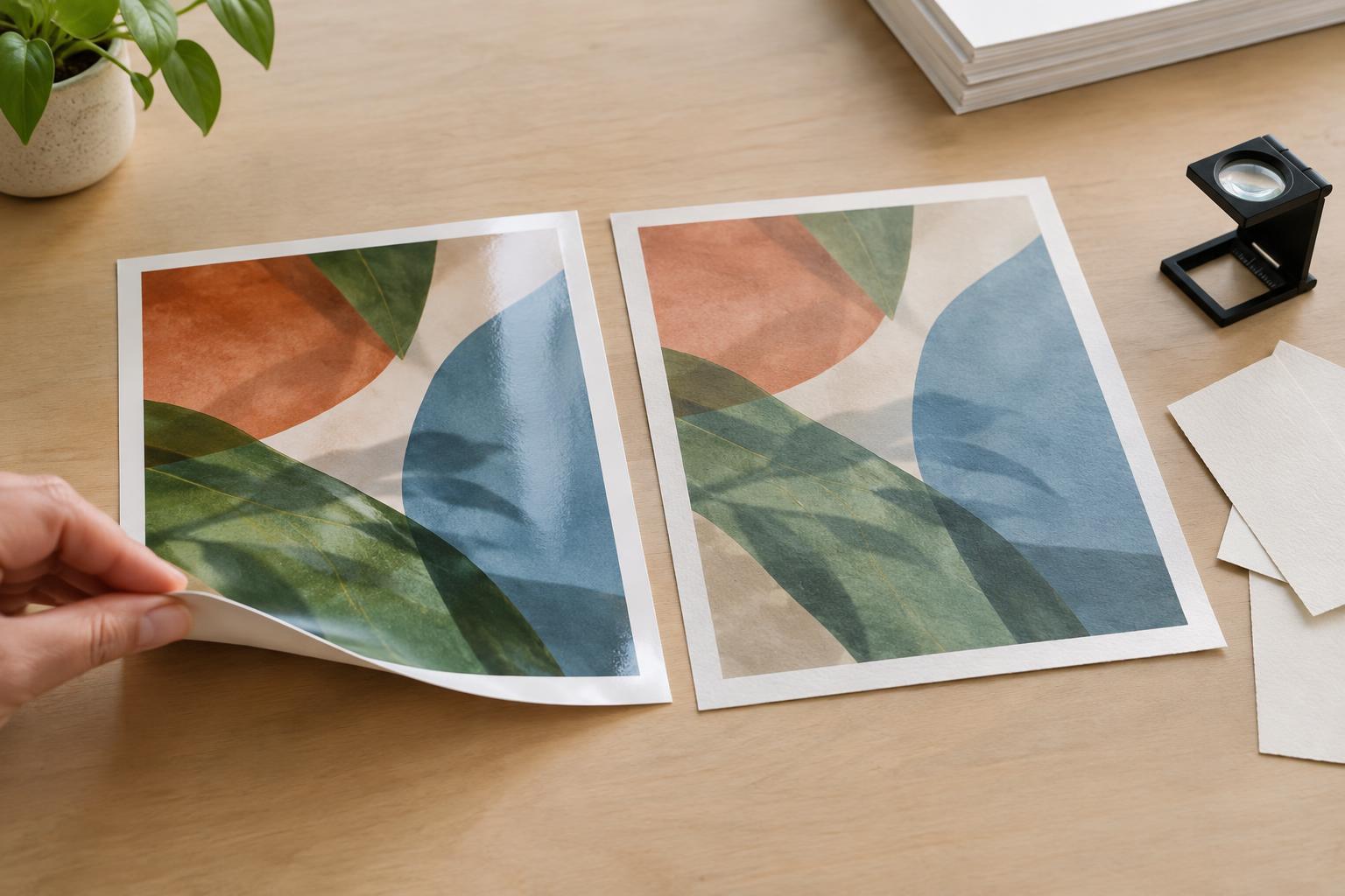
On coated stock, ink generally stays closer to the surface. This can help photographs retain fine detail and give large color areas a denser, more defined appearance. Gloss coatings reflect more light, which can make images appear vivid but may also create glare. Matte and silk coatings offer different balances of reflection and image clarity.
On uncoated stock, ink tends to absorb and spread more. Colors may look softer or less saturated, and very small image details can appear less crisp. That effect can be an advantage when a design calls for a quiet, tactile character. It can be a problem when the layout depends on brilliant color, deep dark tones or delicate photographic transitions.
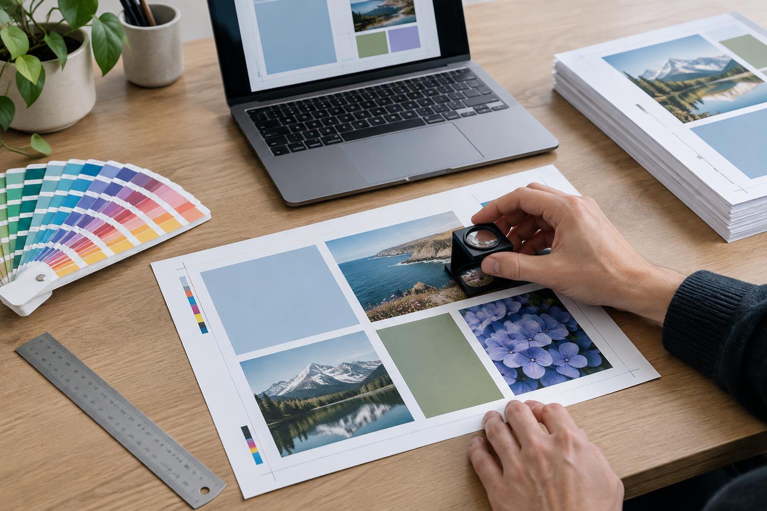
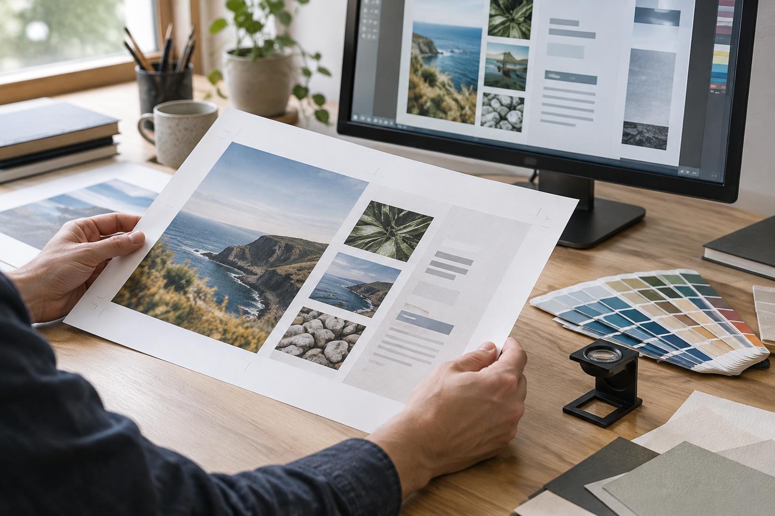
A screen preview cannot reliably show these differences. If a brand color matters, ask the printer for samples or a proof on a paper close to the intended stock. Discuss whether the print files need adjustment for that paper and printing process. Changing the paper late in production can change the appearance of a carefully chosen palette.
Think about reading and handling
The best surface for an image is not always the best surface for reading. A glossy sheet may suit a photo-led brochure, but reflections can make long passages harder to read under some lighting. Uncoated paper often reduces that kind of glare, making it a useful candidate for text-heavy guides, forms and stationery. Type size, contrast and line spacing still matter more than paper choice alone.
Consider what happens after the piece leaves the printer. If customers need to write on it, uncoated stock is usually the simpler starting point. Pen performance can vary with the paper, ink and any additional finish, so test with the tools people are likely to use. For a card that will be handled repeatedly, ask about scuffing, fingerprints and whether a protective finish is appropriate. A coating can change both the feel of the piece and the ease of writing on it.
Choose for the job, not the label
Imagine a small bakery making two pieces from the same visual identity. A counter card built around a close-up product photograph might benefit from a coated sheet that holds image detail. A takeaway order form might work better uncoated because staff and customers need to mark it quickly. Keeping the typography and core colors consistent does not require printing every item on identical paper.
Paper choice also affects budget and production options, but price cannot be inferred from “coated” or “uncoated” alone. Sheet weight, format, quantity, availability and finishing all contribute. Ask for comparable quotes on specific stocks rather than treating either category as the cheaper option. If environmental considerations are important to your brief, request details for the actual papers under consideration instead of assuming one surface type is inherently better.
Make a small proof before a large commitment
Before approving a run, write down the piece’s priorities: accurate-looking photography, comfortable reading, a writable surface, a particular tactile impression or resistance to frequent handling. Rank them. This turns a vague preference for “nice paper” into a decision your printer can help evaluate.
Then compare physical samples in lighting similar to where the piece will be seen. Look at the darkest image areas, pale colors, small text and large blocks of ink. Fold a sample if the design will be folded, and write on it if anyone will need to add notes. Confirm the final stock and any coating or finish when approving the proof. The goal is not to find a universally superior paper; it is to make the printed object behave as the design intends.