Start with what the printed piece needs to do
Choosing paper is easier when you begin with the object rather than a specification. A leaflet handed out at an event may need to feel tidy while remaining easy to carry. A folded brochure needs to open comfortably and survive repeated handling. A business card needs enough stiffness to hold its shape. Those requirements point toward different stocks, even if the same brand artwork appears on each piece.
Write a short production brief before asking for paper samples: what is being printed, its finished size, whether it folds, how it will be distributed and what the reader should notice first. Include any practical limits, such as a mailing requirement or a budget. This gives a printer a more useful starting point than asking for the “best” paper.
Know the difference between weight and thickness
Paper weight is commonly stated in grams per square metre, or gsm. It describes how much a standard area of paper weighs, not how thick one sheet is. Thickness, sometimes called caliper, describes the distance between the two faces of a sheet. Two papers with the same gsm can have noticeably different thicknesses because their fibres, coatings and construction differ.
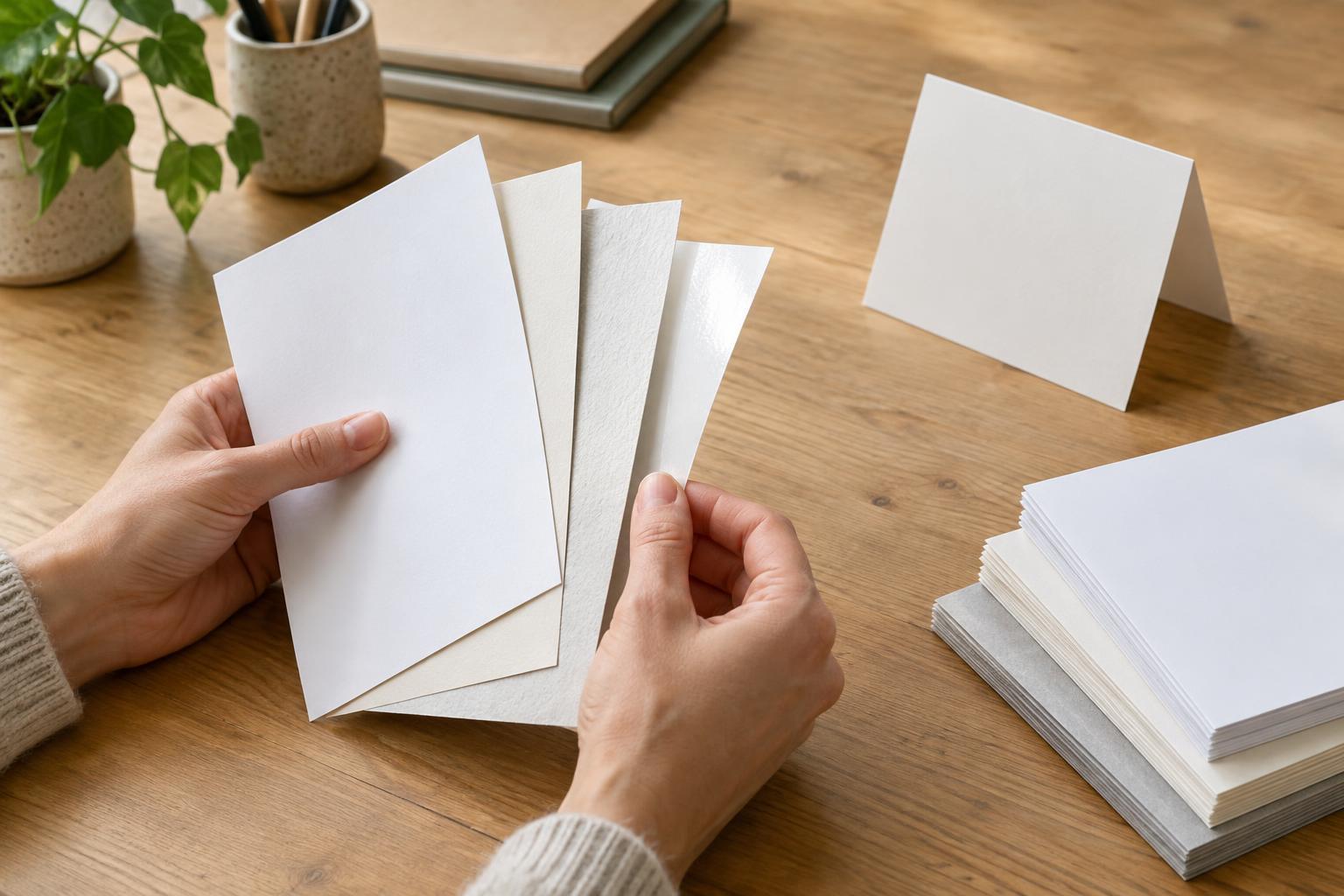
That difference matters when you want a particular feel. A bulkier uncoated sheet may feel substantial without being especially heavy; a denser coated sheet of similar weight may feel slimmer. Neither is automatically better. If you are comparing options, ask for both the gsm and a physical sample rather than assuming a higher number will deliver the stiffness, texture or opacity you want.
Weight and thickness also affect a job in different ways. Total weight matters when pieces are mailed or carried in quantity. Thickness matters when a card must fit a holder or a multi-page booklet must fold and bind neatly. Keep those constraints separate in the brief so one attractive sample does not quietly create a production problem.
Match the stock to images, text and handling
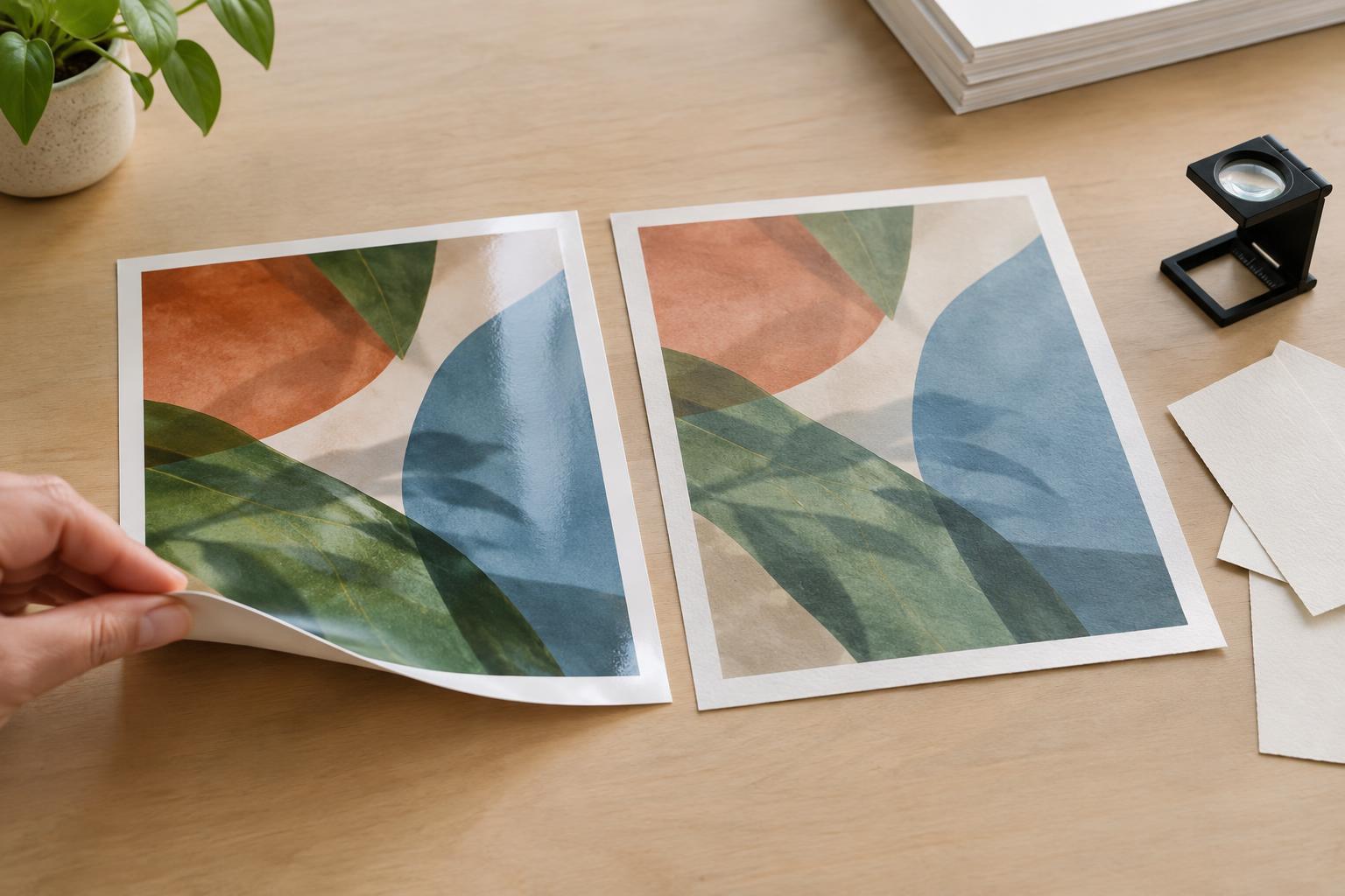
Consider how the artwork will sit on the page. A smooth coated stock can give photographs and areas of solid colour a crisp appearance. An uncoated stock often offers a softer visual effect and a surface that suits writing by hand. Both categories contain many variations, so judge the actual sample with your design in mind. A small type size, pale ink or photograph with subtle dark detail may look different once printed on the chosen surface.
Opacity deserves attention when printing on both sides. If text or imagery shows through enough to distract the reader, ask to see a more opaque option or reconsider the layout. Also think about handling: will someone need to write on the piece, put it in a pocket or keep it on a desk? A stock that looks striking in a sample book may be awkward for the way people will use the finished item.
You can make these choices concrete with a simple test. Place a sample in the lighting where the piece is likely to be read, hold it as a reader would and put a marked-up sheet behind it to check show-through. This will not replace a print proof, but it can reveal practical issues before you commit to a full run.
Plan folds and finishing before ordering
A thicker or stiffer sheet can be appealing until it needs to fold. Depending on the stock and design, a fold may need scoring to open cleanly. Heavy ink coverage across a fold can make cracking more visible, particularly on some coated stocks. Ask your printer about scoring, grain direction and any finishing requirements before finalising artwork for a folded brochure, card or sleeve.
Finish can change the feel and appearance too. A coating, laminate or other treatment may add protection or alter the surface, but it can also affect writability, folding and the way colours appear. If the piece will be trimmed, folded or bound, confirm that the proposed combination of paper and finish works with those steps. Treat the stock and finishing process as one decision, not two separate upgrades.
Choose with samples and a relevant proof
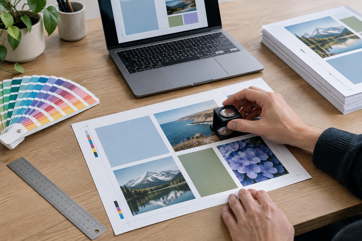
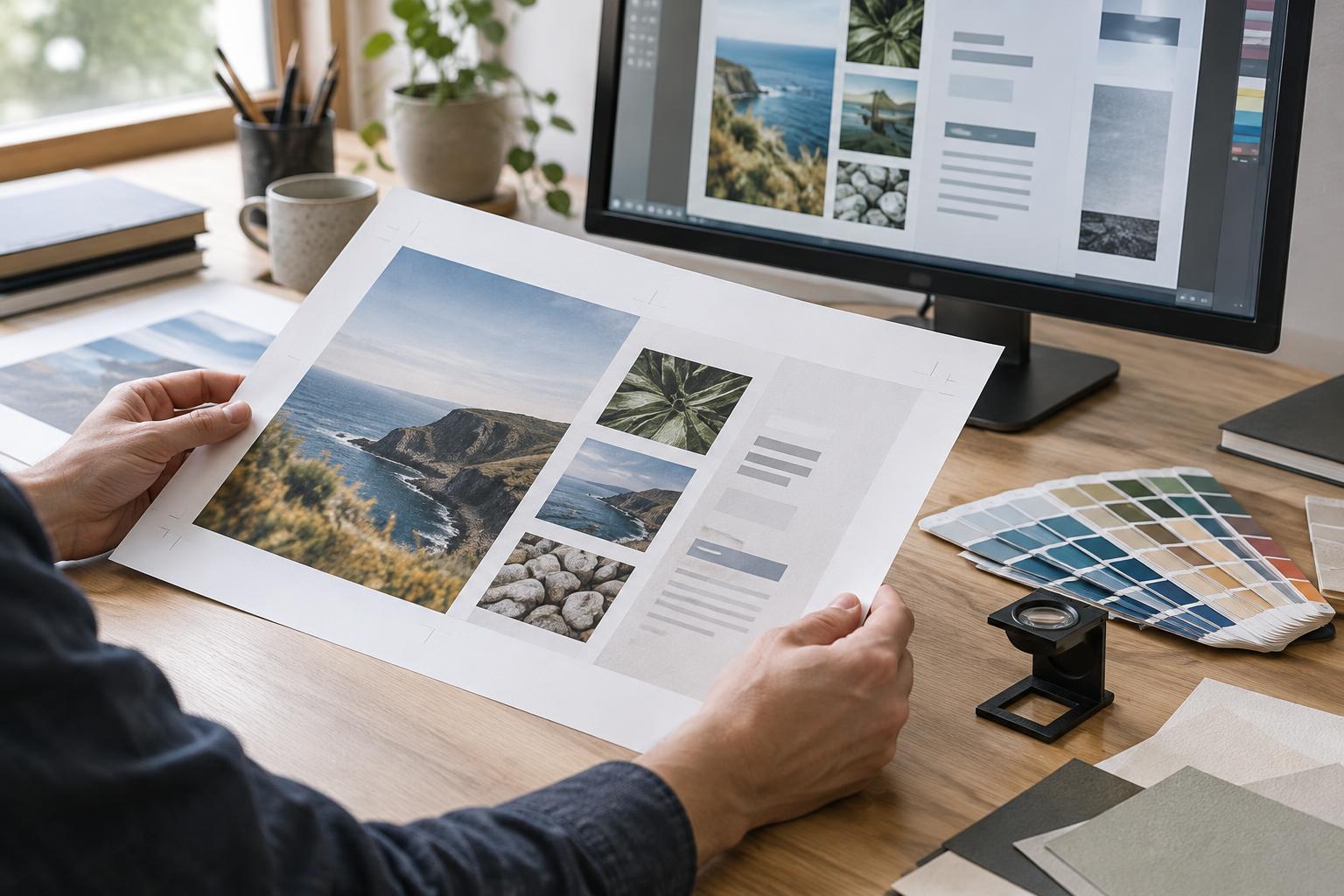
Narrow the options to two or three stocks that meet the brief. Compare them at the same finished size where possible; a small swatch does not convey how a full brochure page will bend or how a card will feel in the hand. If available, request examples printed with similar image coverage or ask for a proof on the intended stock. An on-screen preview cannot show texture, stiffness or show-through.
Before approval, confirm the stock name, gsm, finish, finished size and any folding or binding details with the printer. For a repeat project, keep a labelled sample of the approved piece so future orders have a clear reference. The aim is not to find a universally superior paper. It is to choose one whose appearance, feel and production behaviour support the message and the way the piece will be used.