Give every prop a job
Before collecting objects for a shoot, write down what the photograph needs to communicate. Is the product meant to look portable, useful in a particular setting, or suited to a certain mood? A prop earns its place when it helps answer that question. A notebook beside a pen suggests use; a hand holding it shows scale. Objects that add only decoration are easier to remove.
Keep the brief narrow. For a jar of tea, the product, a cup and a few loose leaves may tell a complete story. Adding a book, blanket, candle and vase introduces several competing stories. If you want a richer scene, choose one idea—such as a quiet afternoon—and make every visible object support it.
Props should never conceal information the viewer needs. Check that the product’s shape, label and important details remain readable from the intended camera angle. A beautiful arrangement is less useful if a leaf crosses the brand name or a cup hides the packaging.
Build a clear visual hierarchy
The product should be the easiest element to notice first. Give it a deliberate position in the frame, then place supporting objects around it rather than scattering them evenly. A simple starting point is to set the product down alone, choose the camera angle, and add one prop at a time. After each addition, look at the image from a distance or as a small thumbnail. If your eye goes to a prop first, adjust or remove it.
Size, contrast and sharpness all affect attention. A large, dark prop beside a small, pale product may dominate even when it sits at the edge of the frame. Try a smaller version, move it farther from the product, or choose a quieter color. With a controllable camera, depth of field can help soften background objects, but blur should support a strong arrangement rather than compensate for clutter.
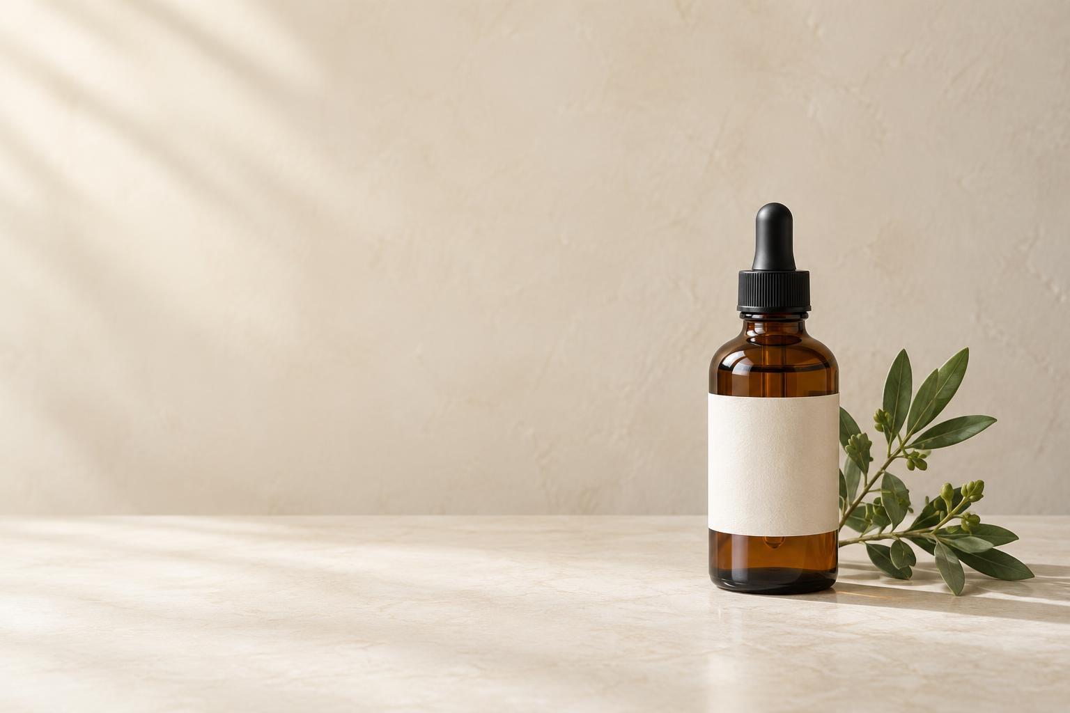
Leave breathing room where it helps the composition. Negative space can separate the product from nearby objects and make room for campaign copy or a crop for another format. Check those intended uses before filling every corner of the image.
Choose materials and colors that support the subject
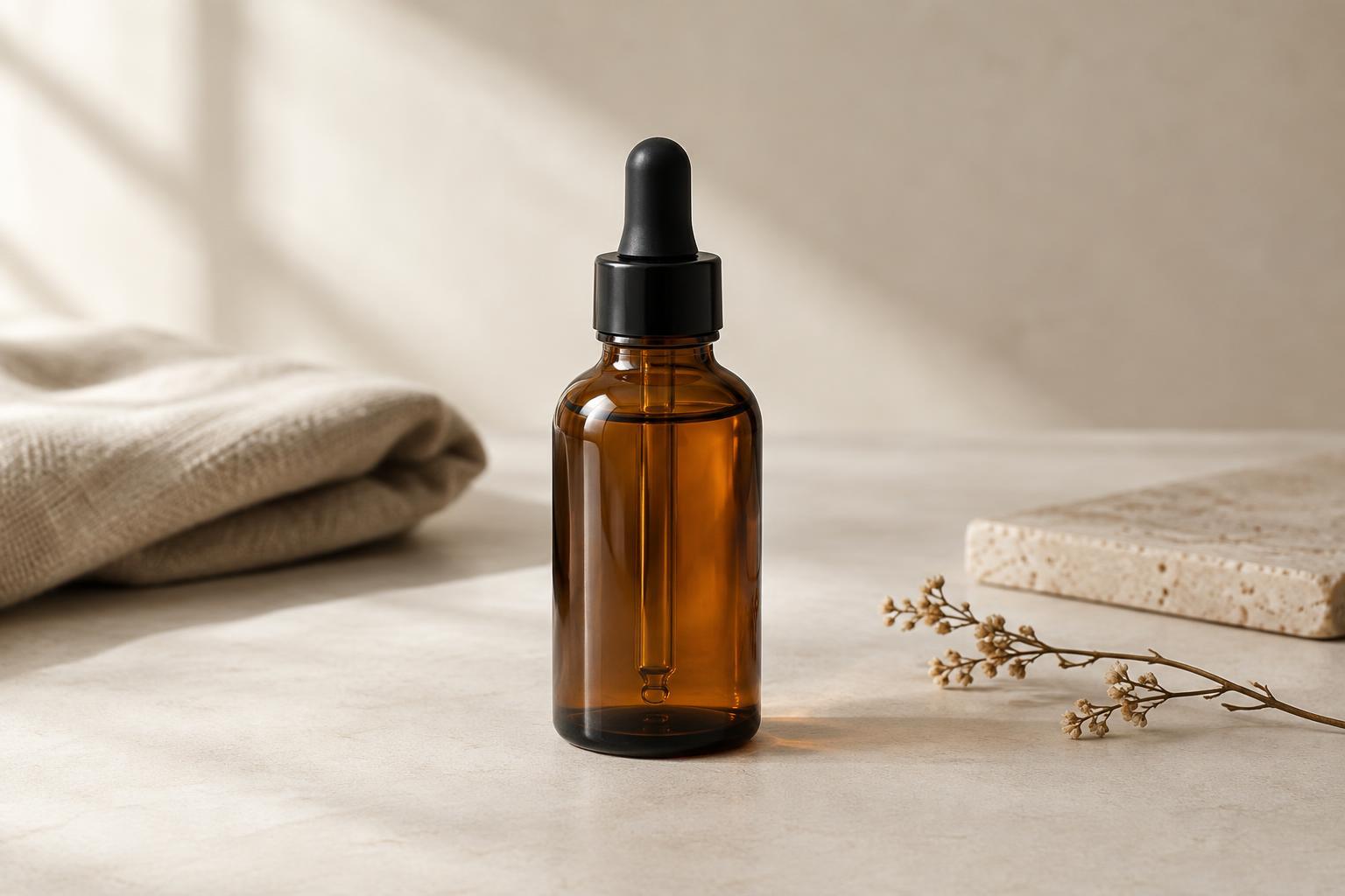
Start with the product’s own palette and surfaces. Props in related or restrained colors often sit comfortably beside it, while a contrasting color can work when used sparingly to direct attention. Match the visual energy of the materials, too: rough linen may suit a handmade ceramic piece, while a clean acrylic block may better support a sleek device. These are choices to test, not fixed rules.
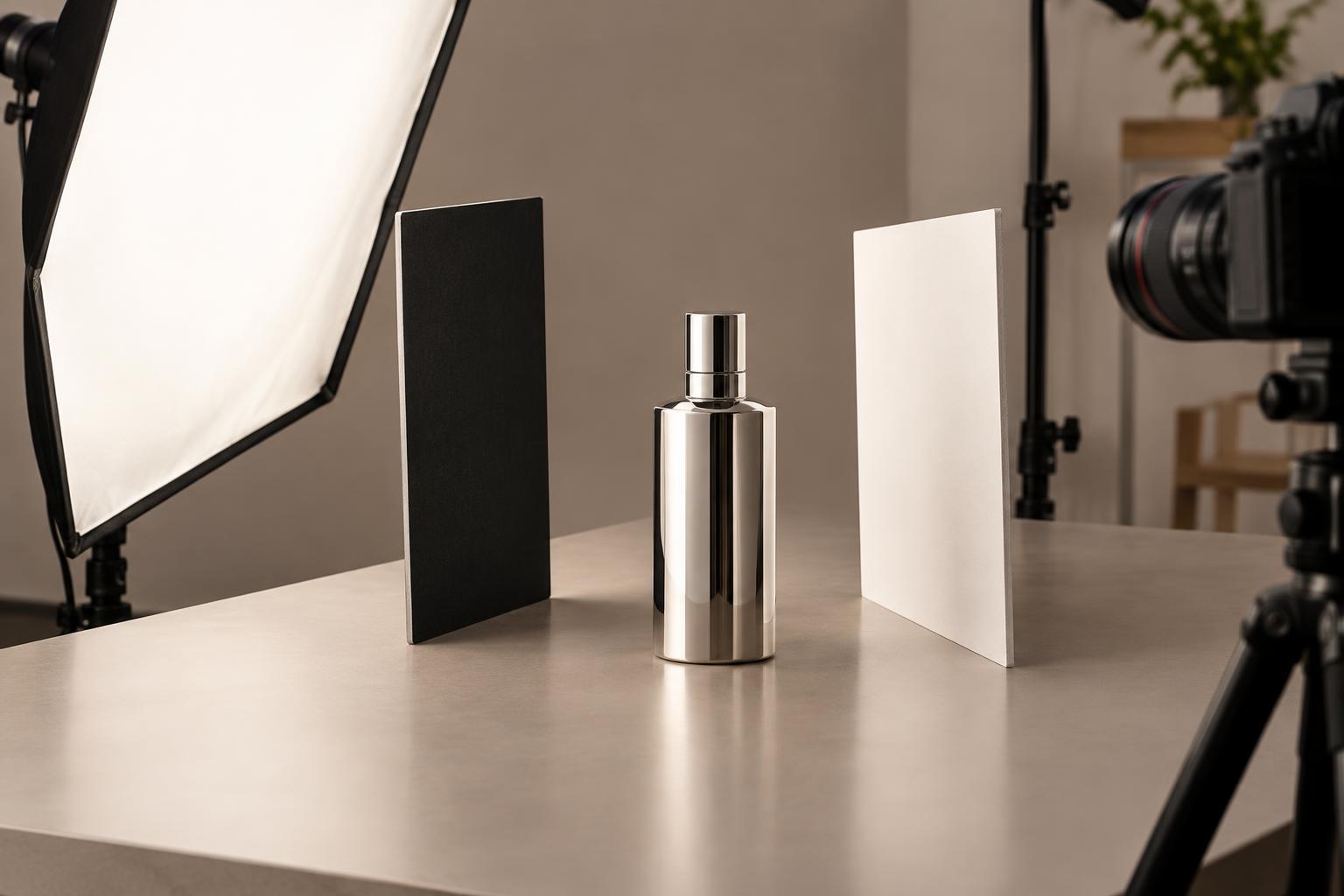
Texture adds depth, but too many patterns create visual noise. If the packaging has detailed typography or a busy illustration, try a plain backdrop and simple props. If the product is minimal, a textured surface may give the photograph enough character without requiring more objects. Watch for reflections as well: shiny props can catch bright highlights that compete with the product.
When possible, select props that feel plausible in the product’s world. An ingredient can help explain a food item; a tool can suggest how an object is made or used. Avoid implying something untrue about the product. A styling choice should provide context, not make a claim the photograph cannot support.
Arrange the scene for the camera, not the tabletop
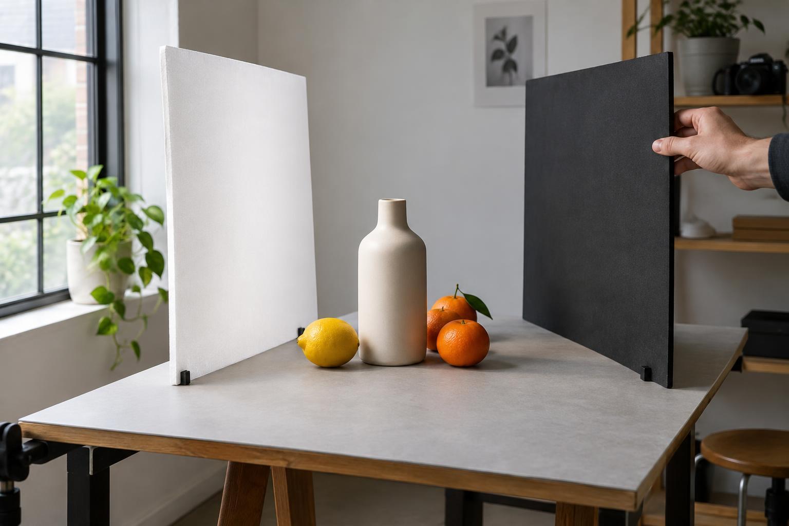
An arrangement that looks balanced from above may feel crowded at eye level. Set the camera at the intended shooting position early, then move props while checking the frame. Look for objects that appear to touch the product’s outline, stems or lines that point out of frame, and overlapping shapes that make the scene hard to read.
Use spacing to establish relationships. A prop placed close to the product feels connected; one set farther away becomes background. Small changes can matter, so try shifting an object rather than immediately adding another. If a scene feels empty, consider whether a shadow, a fold in fabric or a slight change in camera position would solve the problem more quietly.
Light belongs in the styling plan. A prop may cast a useful shadow, but it may also shade the label or create a distracting reflection. Rotate or reposition objects under the actual shoot lighting before committing to the arrangement.
Edit with a simple final check
Take a test frame, then ask three questions: What do I notice first? Can I understand the product quickly? What changes if I remove one prop? Comparing a fuller frame with a pared-back version is often more useful than judging either image on its own. Keep the objects that clarify the message or improve the composition; let the rest go.
Finally, review the photograph at the size and shape in which it will appear. A prop that reads as subtle on a large screen may become a confusing shape in a small social crop. The strongest product styling does not necessarily use the fewest objects. It uses only the objects that help the viewer see what matters.