Two ways to put color on a page
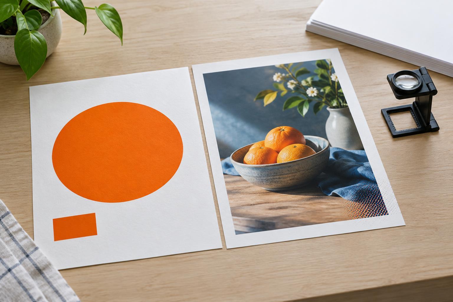
Process printing builds color from four inks: cyan, magenta, yellow and black, commonly called CMYK. A press lays down tiny dots of these inks in varying amounts. Viewed at a normal distance, the dots blend into images and other colors. This makes process printing a natural choice for photographs, illustrations with many shades, and layouts containing several unrelated colors.
A spot color is a separate ink specified for a particular color. Rather than building that color from CMYK dots, a conventional press prints it as its own ink. A design might use one spot color for a logo, or two for an entire poster. The distinction matters because every separate ink in a conventional print job needs its own printing setup. Ask your printer how a proposed spot color will be produced, especially on a digital press, where it may be simulated rather than printed with a separate ink.
When a spot color earns its place
Spot color is useful when a particular hue is central to a brand. If a logo appears on stationery, packaging and event materials, specifying a named ink gives printers a clearer target than an on-screen color alone. It does not guarantee identical results everywhere: paper, finish, ink coverage and printing method can all affect appearance. But it provides a consistent reference for discussing and checking the color.
Spot inks can also do things standard CMYK cannot reproduce convincingly. Metallic and fluorescent effects, for example, call for an appropriate specialty ink and suitable materials. A simple design may benefit from a limited spot-color palette too. A one-color flyer printed in a carefully chosen ink can feel deliberate without requiring a full-color image. Whether it is economical depends on the quantity, press and printer’s setup; do not assume fewer colors always means a lower quote.
When process color is the practical choice
Choose CMYK when the design depends on photographs, gradients, varied illustrations or a broad palette. A café menu with food photography and colorful diagrams would be awkward to reproduce with only one or two spot inks. Process printing also avoids adding a separate ink for every distinct brand or campaign color in the layout.
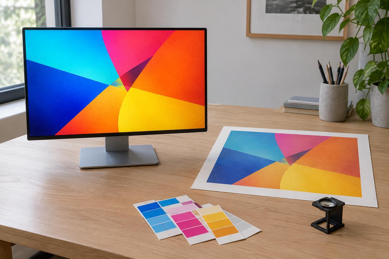
CMYK has limits. Some vivid colors visible on a screen or available as spot inks cannot be matched closely with process inks on paper. Converting a spot-color logo to CMYK may make it look duller or shift its hue. That does not automatically make process printing the wrong choice. It means the converted version should be reviewed as a deliberate production variant, not treated as an invisible file-setting change.
Use the job to make the decision
Start with the piece itself. A photographic brochure will usually point toward CMYK. A two-color invitation with a distinctive bright accent may be a candidate for spot printing. Packaging that combines photographs with a brand color may call for CMYK plus one spot ink, if the budget and production method support it. In that case, the brand ink is an addition to the four process inks, not a replacement for them.
Then consider how the piece will be printed and how many copies are needed. Conventional presses may make an extra ink worthwhile across a larger run, while digital printing may suit a short run even if it simulates the requested spot color. Paper is part of the decision as well: the same ink can look different on an absorbent uncoated sheet and a smoother coated one. Give the printer the intended paper, quantity and color priorities before asking which route makes sense.
Prepare files and proofs with intent
Keep color definitions clear in the artwork. If a spot ink is required, use one consistent named swatch rather than several nearly identical versions. If the job is CMYK-only, check how any spot colors will be converted before sending the final file. Make sure linked photographs are suitable for the printer’s requested workflow, and tell the printer which colors matter most to the design.
Request a proof appropriate to the decision you need to make. A screen preview can help catch layout mistakes, but it cannot reliably show the final appearance of ink on paper. A printed proof may give a better indication, though its accuracy depends on how it is made. For a color-critical job, ask what the proof represents and whether you can review a sample on the chosen stock. The goal is not to pick the more sophisticated-sounding method; it is to choose a production plan that preserves what matters in the design.